
Introducing Custom Elements Manifest
The idea for a web-components.json was first suggested in
this GitHub issue on the web components GitHub repository, by Pine from the VS Code team, with the initial goal for IDEs to be able to better support custom elements.
Developers tend to have many differing opinions, and standardization tends to... take time. More than 3 years later, we are happy to finally be able to share with you: Custom Elements Manifest 🎉
Custom Elements Manifest is a file format that describes the custom elements in your project. This format will allow tooling and IDEs to give rich information about the custom elements in a given project. A custom-elements.json contains metadata about the custom elements in your project; their properties, methods, attributes, inheritance, slots, CSS Shadow Parts, CSS custom properties, and a modules exports. If you're interested in following the specification of the schema, or contributing to it, you can find the repository here: webcomponents/custom-elements-manifest.
It's important to note that the Custom Elements Manifest schema is a community standard, discussion takes place in the open and is accessible to anyone. Discussions about the schema have included engineers from a wide variety of stakeholders like: Adobe, Stencil, Google, Open Web Components, ING, and more.
Example
Here's an example:
class MyElement extends HTMLElement {
  static get observedAttributes() {
    return ['disabled'];
  }

  set disabled(val) {
    this.__disabled = val;
  }
  get disabled() {
    return this.__disabled;
  }

  fire() {
    this.dispatchEvent(new Event('disabled-changed'));
  }
}

customElements.define('my-element', MyElement);
Will result in the following custom-elements.json:
{
  "schemaVersion": "1.0.0",
  "readme": "",
  "modules": [
    {
      "kind": "javascript-module",
      "path": "src/my-element.js",
      "declarations": [
        {
          "kind": "class",
          "description": "",
          "name": "MyElement",
          "members": [
            {
              "kind": "field",
              "name": "disabled"
            },
            {
              "kind": "method",
              "name": "fire"
            }
          ],
          "events": [
            {
              "name": "disabled-changed",
              "type": {
                "text": "Event"
              }
            }
          ],
          "attributes": [
            {
              "name": "disabled"
            }
          ],
          "superclass": {
            "name": "HTMLElement"
          },
          "tagName": "my-element"
        }
      ],
      "exports": [
        {
          "kind": "custom-element-definition",
          "name": "my-element",
          "declaration": {
            "name": "MyElement",
            "module": "src/my-element.js"
          }
        }
      ]
    }
  ]
}
Potential Usecases
Why Custom Elements Manifest?
Documentation and demos
Documentation viewers should be able to display all the relevant information about a custom element, such as its tag name, attributes, properties, definition module, CSS variables and parts, etc.
Using a custom-elements.json file, it would be easy to generate or display demos for your component using tools such as api-viewer-element, or automatically generate Storybook knobs for your components. 11ty plugins could be created to automatically create your documentation sites for you.
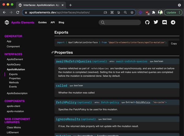
Another great example is Apollo Elements by Benny Powers, which uses a Custom Elements Manifest to generate their documentation:
At the time of writing, we are also working on adding support for Custom Elements Manifest version 1.0.0 to Storybook. You can track the progress here: feat: support Custom Elements Manifest v1.
Framework Integration
React currently is the only major framework where custom elements require some special handling. React will pass all data to a custom element in the form of HTML attributes, and cannot listen for DOM events coming from Custom Elements without the use of a workaround.
The solution for this is to create a wrapper React component that handles these things. Using a custom-elements.json file, creation of these wrapper components could be automated.
Some component libraries like Fast or Shoelace provide specific instructions on how to integrate with certain frameworks. Automating this integration layer could make development easier for both authors of component libraries, but also for consumers of libraries.
Avoiding breaking API changes in minor or patch versions
Another interesting usecase, inspired by elm-package, is that tooling could be able to detect whether or not the public API of a custom element has changed, based on a snapshot of the current custom-elements.json file to decide the impact of an update, and potentially prevent breaking API change in patch or minor versions.
Linting
Linters will be able to give accurate contextual information about your custom element. Are you setting an attribute on a custom element that is not supported? Are you adding an event listener to a custom element that it doesn't fire? With the use of custom-elements.json, linters will be able to warn you, and catch mistakes early.
Cataloging
A major usecase of custom-elements.json is that it allows us to reliably detect NPM packages that for certain contain custom elements. These packages could be stored, and displayed on a custom elements catalog, effectively a potential reboot of webcomponents.org. This catalog would be able to show rich demos and documentation of the custom elements contained in a package, by importing its components from a CDN like unpkg, and its custom-elements.json file.
Much, much more!
We believe custom-elements.json will open the door for a lot, lot more new exciting ideas and tooling. Which usecases can you come up with? Do you have an idea, but are unsure where to start? Feel free to reach out to us on the Lit and Friends slack in the #open-wc channel, we're always happy to have a chat and help you get started.
How should I use a Custom Elements Manifest?
If you're publishing a component, or a library of components, we recommend people to create a Custom Elements Manifest and publish it alongside your components to NPM.
We recommend authors of components to add a "customElements": "./custom-elements.json" to your project's package.json. This allows tools to easily find whether or not a package contains a Custom Elements Manifest, and read its contents.
If your package makes use of Export Maps, make sure to also add your Custom Elements Manifest there under the "customElements" key. This will allow consumers of your manifest to easily import it like so:
import cem from '@my-element/customElements' assert { type: 'json' };
🛠 The Tools
It's unlikely that developers will write their custom-elements.json file by hand. So at Open Web Components, we worked hard on a tool that does it for you!
@custom-elements-manifest/analyzer
@custom-elements-manifest/analyzer will scan the source files in your project, and generate a custom-elements.json for you.
Here's how you can use it today:
npx custom-elements-json analyze
✨ Or try it out in the online playground! ✨
@custom-elements-manifest/analyzer by default supports standard JavaScript, and vanilla web components. Dedicated web component libraries can be supported through the use of plugins. Currently, support for LitElement, Fast, Stencil and Catalyst is provided in this project via plugins. You can enable them by using the CLI flags --litelement, --fast, --stencil, --catalyst and --catalyst-major-2 respectively, or loading the plugin via your custom-elements-manifest.config.js.
TL;DR:
- JavaScript
- TypeScript
- LitElement (opt-in via CLI flag)
- FASTElement (opt-in via CLI flag)
- Stencil (opt-in via CLI flag)
- Catalyst (opt-in via CLI flag)
- Atomico (opt-in via community plugin)
Support for other web component libraries can be done via custom plugins, feel free to create your own for your favourite libraries.
Plugins
Different projects often have different requirements, and ways of documenting their components. Do you need to support custom JSDoc? Custom Decorators? Custom libraries? Custom anything? @custom-elements-manifest/analyzer has a rich plugin system that allows you to extend its functionality, and add whatever extra metadata you need to your custom-elements.json.
A plugin usually is a function that returns an object, and has several hooks you can opt in to:
- collectPhase: First passthrough through the AST of all modules in a project, before continuing to the
analyzePhase. Runs for each module, and gives access to a Context object that you can use for sharing data between phases, and gives access to the AST nodes of your source code. This is useful for collecting information you may need access to in a later phase. - analyzePhase: Runs for each module, and gives access to the current Module's moduleDoc, and gives access to the AST nodes of your source code. This is generally used for AST stuff.
- moduleLinkPhase: Runs after a module is done analyzing, all information about your module should now be available. You can use this hook to stitch pieces of information together.
- packageLinkPhase: Runs after all modules are done analyzing, and after post-processing. All information should now be available and linked together.
TIP: When writing custom plugins, ASTExplorer is your friend 🙂
Let's take a look at an example plugin:
Imagine we have some sourcecode, with a custom @foo JSDoc annotation and some information that we'd like to add to our custom-elements.json:
my-element.js:
export class MyElement extends HTMLElement {
  /**
   * @foo Some custom information!
   */
  message = ''
}
In a custom plugin, we have full access to our source code's AST, and we can easily loop through any members of a class, and see if it has a JSDoc tag with the name foo. If it does, we add the description to our custom-elements.json:
custom-elements-manifest.config.js:
export default {
  plugins: [
    {
      name: 'foo-plugin',
      analyzePhase({ts, node, moduleDoc, context}){
        switch (node.kind) {
          case ts.SyntaxKind.ClassDeclaration:
            /* If the current AST node is a class, get the class's name */
            const className = node.name.getText();

            /* We loop through all the members of the class */
            node.members?.forEach(member => {
              const memberName = member.name.getText();

              /* If a member has JSDoc notations, we loop through them */
              member?.jsDoc?.forEach(jsDoc => {
                jsDoc?.tags?.forEach(tag => {
                  /* If we find a `@foo` JSDoc tag, we want to extract the comment */
                  if(tag.tagName.getText() === 'foo') {
                    const description = tag.comment;

                    /* We then find the current class from the `moduleDoc` */
                    const classDeclaration = moduleDoc.declarations.find(declaration => declaration.name === className);
                    /* And then we find the current field from the class */
                    const messageField = classDeclaration.members.find(member => member.name === memberName);

                    /* And we mutate the field with the information we got from the `@foo` JSDoc annotation */
                    messageField.foo = description
                  }
                });
              });
            });
        }
      }
    }
  ]
}
And the output custom-elements.json will look like this:
{
  "schemaVersion": "1.0.0",
  "readme": "",
  "modules": [
    {
      "kind": "javascript-module",
      "path": "src/bar.js",
      "declarations": [
        {
          "kind": "class",
          "description": "",
          "name": "MyElement",
          "members": [
            {
              "kind": "field",
              "name": "message",
              "default": "",
+             "foo": "Some custom information!"
            }
          ],
          "superclass": {
            "name": "HTMLElement"
          },
          "customElement": true
        }
      ],
      "exports": [
        {
          "kind": "js",
          "name": "MyElement",
          "declaration": {
            "name": "MyElement",
            "module": "src/bar.js"
          }
        }
      ]
    }
  ]
}
To get started developing custom plugins, take a look at the cem-plugin-template repository to quickly get you up and running, and take a look at the Authoring Plugins documentation for more in depth information.
Concluding
We're excited and look forward to see what sorts of tooling you'll build with the Custom Elements Manifest. Do you have a cool idea for tooling, or do you want to add support for your library, but are you unsure how to get started? Drop by the Lit and Friends slack in the #open-wc channel!